27 July
Camera
FUJIFILM X100VI
CameraFUJIFILM X100VI23mmf/5.61/4000s800
Intent
Behind the frame
- What I was trying to do:
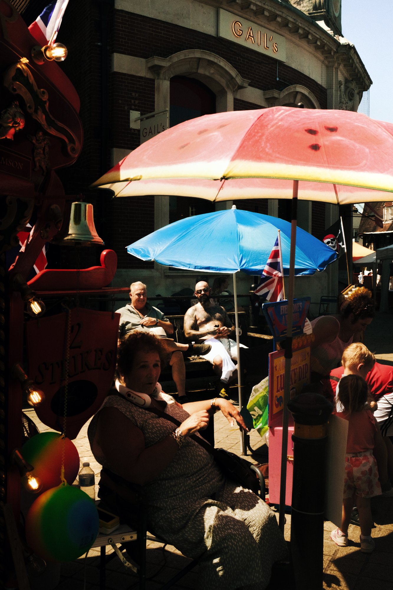
- It's funny how inherently blue life is when you're out looking for it, and yet, out of all the photographs I took with blue as the focus, it's the frame with the least blue that draws me in the most. A frame so colourful, I'd often choose not to take it, but it's the wash of reds, oranges, yellows that bleed from edge to edge, as well as the harsh light and shaded dark tones our fellas sat in, that seemingly creates such a unique sense of focus. Altogether a very British layering of watermelon, flags and orbs of multicolours. I'm inclined to say I like it just about as much in black & white and it argues the case for shooting in sub-optimal light to find real contrast in my day-to-day work.
- What worked:
- I'm always mulling over whether an alternative lens choice would have benefited the composition. In this case the top right lends itself as a source of light, the Gail's sign places you firmly and exclusively in the UK, and the leading lines wrap around the building creating a sense of depth. But in equal measure, would it have worked better on a 50mm, compressing the focus and narrowing the gaze, creating a more distinctive vignette? I guess it's apples & oranges.
- What I'd do differently:
- I'm actively trying to take a few varying photos from the same scene so that I can have more choice, albeit it's not always an option.
Response
Community feedback
Members can leave feedback on every submission. Join Framelines to take part.
Join Framelines